The beloved plumber brothers, Mario and Luigi, almost had a grittier, edgier makeover in their latest game. However, Nintendo stepped in to ensure the game retained its signature charm. Let's delve into the art direction journey of Mario & Luigi: Brothership.
Exploring Artistic Styles
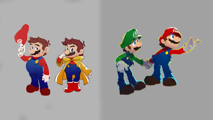
In a December 4th Nintendo developer interview, Acquire, the game's developers, revealed an initial design featuring a more rugged, edgy Mario and Luigi. Nintendo, however, felt this deviated too far from the established characters' identities. Akira Otani and Tomoki Fukushima (Nintendo) and Haruyuki Ohashi and Hitomi Furuta (Acquire) discussed the creative process. Acquire, aiming for 3D visuals that captured the series' unique appeal, experimented extensively, leading to the initial edgy design.
Furuta recounted the team's surprise at Nintendo's feedback, emphasizing the need for a distinctly Mario & Luigi aesthetic. Nintendo provided guidelines outlining the core characteristics of the brothers. Furuta admitted initial concerns about the edgier design's player appeal.
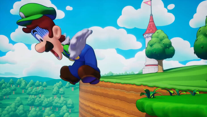
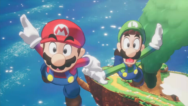
The final art style successfully blended bold illustrations with the comical charm of pixel animation, creating a unique visual identity for the game. Otani highlighted the balancing act between allowing Acquire creative freedom and preserving the essence of Mario.
Navigating Development Challenges
Acquire, known for titles like Octopath Traveler and Way of the Samurai, typically works on less colorful, more serious games. Furuta acknowledged the team's natural inclination towards darker RPG aesthetics. Developing a game featuring such globally recognized characters also presented a unique challenge.
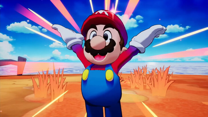
Ultimately, the collaboration proved successful. The team's focus shifted to the fun, chaotic nature of the Mario & Luigi series, resulting in a brighter, more accessible game. Nintendo's design insights improved clarity and playability.